New ‘Aadhaar fail’ tracker maps countrywide pain
Researchers and coders have created an evolving ‘Aadhaar Fail’ map which tracks publicly reported cases where Indians were allegedly denied access to welfare due to Aadhaar authentication failure


Three researchers and coders have created a responsive ‘Aadhaar Fail’ map, similar to the Hindustan Time’s Hate Tracker published earlier. The Aadhaar Fail map tracks publicly available reports of denial of welfare due to failure of Aadhaar authentication. Currently, the map reflects around 200 reports along with the case details, and is an evolving project.
The Aadhaar Fail tracker map was created in a day from data of cases from English news websites and social media. “The map is an interactive one. You click on a location and the detail of the report pops up. There’s also a link to the original report from which the case was scraped. So, the reader can go read it in more detail,” said Siddharthya Roy, one of the creators of the map.
Each case, placed on a Google map for visualisation, is associated with the name of the person affected, their location, type of denial and a link to the data that supports their inclusion in the tracker. The researchers haven’t included instances people were denied welfare due to other reasons, such as lack of ration card or supporting identity card. Click on some cases below to learn more:
The Aadhaar Fail tracker map has been designed and populated by Roy along with Amit Bansal and Anmol Somanchi as a response to the UIDAI chief’s quip that there is no official data available on denial of service due to Aadhaar authentication failure. Attorney General KK Venugopal went a step ahead and stated in the Supreme Court that no person or class of persons have come before the court alleging that they have been denied pension because of want of Aadhaar, or because of their physical biometrics not matching with Aadhaar data.
Will the UIDAI be able to deny the failure of Aadhaar Card now? “Given the UIDAI’s history, they may deny everything yet again. So, I’m not sure what they’ll do. What I’m fairly confident of is that this map will make denial a little more difficult,” emphasised Roy.
“Its common knowledge that Aadhaar is an extremely shoddy system — poor in both design and implementation — and has led to a lot of unnecessary trouble in the lives of Indian citizens. For the poor, in the name of plugging leaks in the PDS, Aadhaar has become a way of denying the basics of welfare which they’re entitled to and are very dependent on. But the UIDAI bluntly refuses to acknowledge the existence of these problems. Moreover, unlike journalists and private citizens, they have the political and financial clout to carry out mass propaganda to that effect,” elaborated Roy.
The creators felt that they needed a platform to collate and counter the clout that the Aadhaar card supporters have. A visual representation, Roy believes, hits much harder than individual stories and makes it very real. It, of course, helps people know that they aren’t alone in their Aadhaar troubles.
“For the others, its turned into a twisted and torturous system where everything from banking to phones to paying taxes et al is being denied because of some glitch in the system here or some bureaucratic indecision there. Then there are the cases of absolute brutality including starvation, denial of emergency hospitalisation and so on. Beyond what is commonly known, there has been considerable reporting — both formal and informal — about these problems as well,” said Roy.
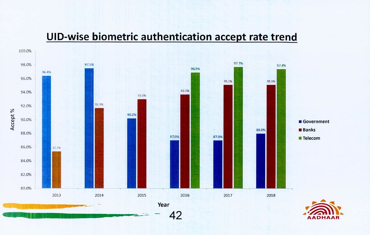
In fact, a graph released by UIDAI shows that 12% of authentication requests failed in case of government services. This means that authentication requests of 16 crore people fail. Surprisingly, Aadhaar details submitted by telecom companies were authenticated more than the ones from the government service providers.
The designers intended this to be an open project, unlike the UIDAI project, which is extremely closed. “The map is free to share and can be used by anyone. The data is open as well and people who can do a better job than us, can go right ahead. In that sense its antithetical to Aadhaar — which is this black box no one is allowed to question,” quips Roy.
They hope to add more features to the map in the next few days. The first upcoming feature will be a mechanism to allow anyone to contribute reports. They are also looking for a way to mitigate fake reports from coming in.
“The second is to make it multilingual. If the map isn’t readable by everyone who is affected, it misses the point. This (and other projects coming to CodeCoolie) are being made with the idea of building a public reporting platform which uses publicly available data and uses computational journalism. So yes, of course this will be an evolving project,” added Roy.
Join our official telegram channel (@nationalherald) and stay updated with the latest headlines